Top 10 attractive Landing Pages you must see!

Top 10 attractive Landing Pages you must see!
Hey, worrying about your business growth plan in lockdown, to active your business in lockdown, you need to increase your online and social presence so that you are connected with your customer 24/7.
An attractive landing page is performing the most important role in your business to get it online.ohh!! you don’t have any thought about what is landing page? what are the roles of the landing page?
Don’t worry! We are here to assist you to let you know about the importance of landing page in business growth. A landing page is also one of the source by which you can generate leads. The more you landing page attractive and easy to understand the more you will acquire leads on in your business.
Let’s go through some fundamental doubt’s about landing page
Now, Let’s go through some fundamental doubt’s about landing page
What Is the landing page?
Roles Of Landing Page
What Is the landing page?
It is similar to a Website, but more powerful and cost-efficient. The landing page will include complete details about your business, reviews by your customers, details about services you provide, and, most importantly, you can get online appointments or online products selling through it.
Roles Of Landing Page
The landing page has a very essential role in digital marketing. If you are branding your business with the help of digital marketing then you must aware of the word “Landing Page”
The landing page is the page where users can land after the click to action.
So how it is important in the term of digital marketing?
When you market a certain product or website through digital marketing, you will get the result in the form of for example leads, product purchases. This result will be possible with the help of the landing page. The landing page should not be the homepage of your website.
The landing page is the standalone page that contains the offers, deals, or the piece of information which attracts the user and helps them to get an idea about your brand that will help you in conversion.
For example, you have an e-commerce site and have various types of products so you have to create separate landing pages for the different products so the relevant user only lands on the particular product page and it will increase the conversions rate.
Want to get inspired? Check out the excellent landing page models below.
UBER Landing Page
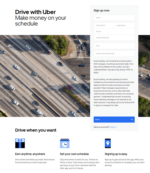
In this Landing page by Uber, In one glimpse maybe you can guess what service uber gives. As they are demonstrating one wide image which contains cars and taxis running on the road by which they are trying to portray their service. you can see the heading convey the purpose in a single sentence, as subheading gives additional information to it, the signup form coolant all the essential information so lead cant get missed.
Also, they properly showcase the key points with a relevant icon that represents the specific service or feature. they designed a perfectly clean and attractive looking landing page.
Canva
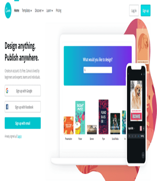
Canva in its self creativity so how can be its landing page so simple! Exactly, look over here the landing page it’s so artistic don’t you think so? The way they used images and gradient behind that its structure everything is properly set at its place. By the heading of canva landing page, we can understand what this website does and subheading gives the additional information to it as well as images clearly show that it is an image editor website where we can edit easily. Also, it allows you to signup or signs in for interaction and engagement.
Salesforce
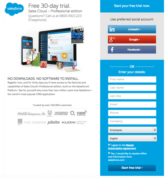
Salesforce designed their landing page very precisely, their heading presents the value of a new trend and offers a commitment on how to achieve it. The sub-headline provides the contact number to allow consumers to initiate the first meeting. The image is short and impactful as it mentions some major organizations that have achieved the gains by implementing the key basis of the book. The safety logos ensure users of their data safety and security.
Salesforce designed their landing page very precisely, their heading presents the value of a new trend and offers a commitment on how to achieve it. The sub-headline provides the contact number to allow consumers to initiate the first meeting. The image is short and impactful as it mentions some major organizations that have achieved the gains by implementing the key basis of the book. The safety logos ensure users of their data safety and security.
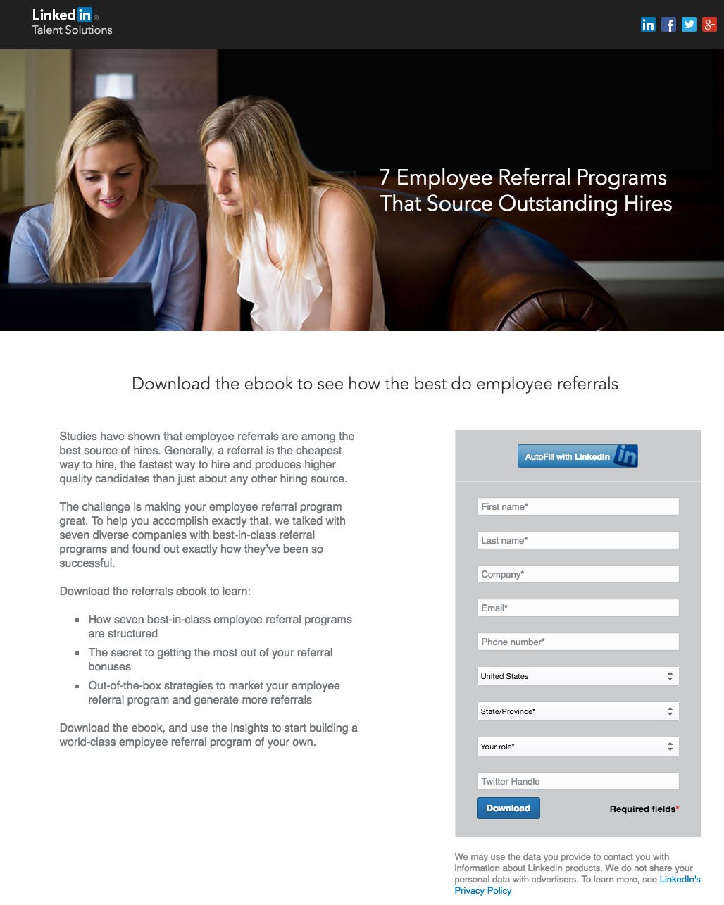
Linkedin is a huge networking platform where anyone can connect with millions of people and share informative data. So, can needy people get help from here. This landing page grasps attention to the headline by setting the webinar’s name without playing with font size. The key study topics are specified in bullet points, and the featured speakers are showcased along with their specifications and links to their LinkedIn profiles. you can sign in with LinkedIn to populate the form fields directly based on your profile data
Amazon
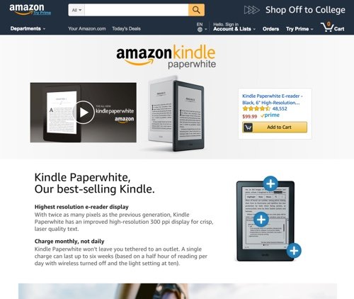
Amazon is a well-known E-commerce website likewise they designed their landing page also. The landing page is so Elucidated and Attractive. This landing page is a page that Amazon sellers use to broadcast their Amazon products and provide amazing customer service. Now, let’s talk about landing page design. they presented heading with some text-shadow which looks so attractive and eye-catchy. The video is attached for a better understanding of product or services to the customer.just after that they listed binge-worthy viewing, binge-watching products, binge-watch like a pro which includes product with its proper detail. this way amazon presented motive and all products, items on the landing page.
Amazon is a well-known E-commerce website likewise they designed their landing page also. The landing page is so Elucidated and Attractive. This landing page is a page that Amazon sellers use to broadcast their Amazon products and provide amazing customer service. Now, let’s talk about landing page design. they presented heading with some text-shadow which looks so attractive and eye-catchy. The video is attached for a better understanding of product or services to the customer.just after that they listed binge-worthy viewing, binge-watching products, binge-watch like a pro which includes product with its proper detail. this way amazon presented motive and all products, items on the landing page.
Swiggy
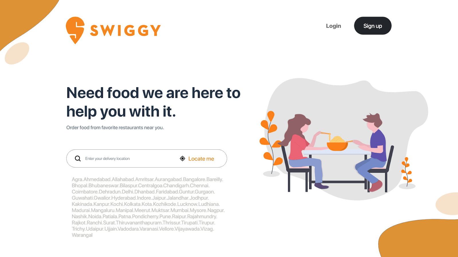
Swiggy is the most utilized service by people.you can see the landing page designed so creative & attractive that any random visitor would be stuck over because this page may bring interest in them to know more about the services that they providing.the landing page presenting its motive in the very precise way .it contain the logo of the service and sing in login button if anyone wants to use this service. The headline represents the service that they are providing.in the location field you can add your present location so they can deliver food at your place.then after that they mentioned all the locations on which their services running. the image over there reflects more about the Swiggy.
Microsoft
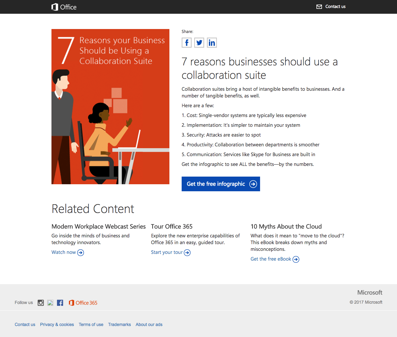
This is Microsoft’s collaborative suite infographics landing page which is marvelous and attractive.we are not just saying it they have proved it via their landing page design. The headline propagating their moto. The numbered bullet points allow visitors to instantly make a decision on if the offer is relevant to them. The infographic picture gives visitors a look at what they will be downloading once they finish the form. The arrow on the button is a visible cue that tells the visitor to move onward and get the infographic by ticking the button. The copyright is current, which represents the user the knowledge on the infographic is recent.
This is Microsoft’s collaborative suite infographics landing page which is marvelous and attractive.we are not just saying it they have proved it via their landing page design. The headline propagating their moto. The numbered bullet points allow visitors to instantly make a decision on if the offer is relevant to them. The infographic picture gives visitors a look at what they will be downloading once they finish the form. The arrow on the button is a visible cue that tells the visitor to move onward and get the infographic by ticking the button. The copyright is current, which represents the user the knowledge on the infographic is recent.
Apple
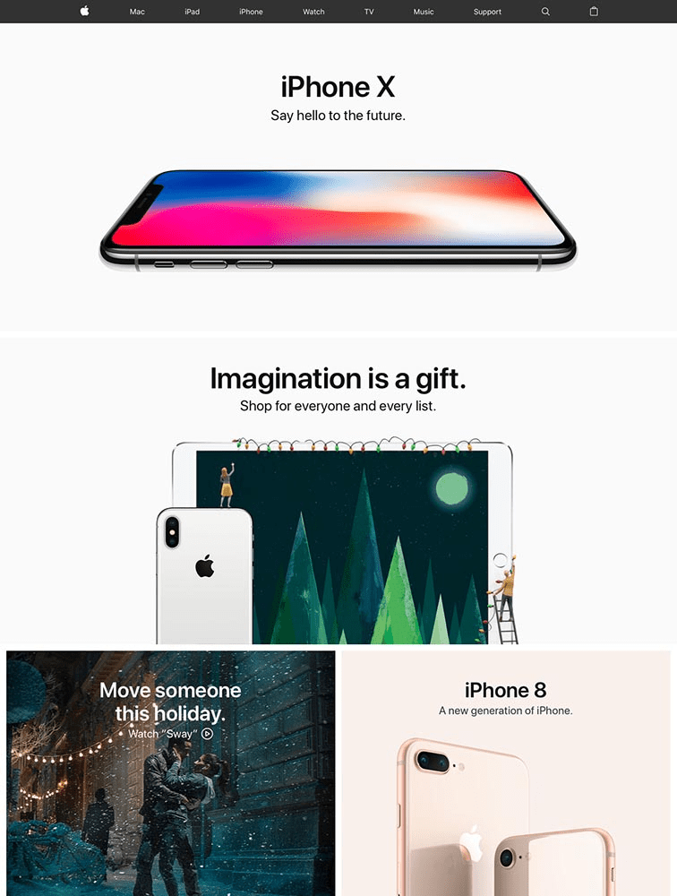
What we can say about the apple website !! it always seeks attention by its 3D animation, design & creativity. They always place their content in such a unique way, that attracts an audience and now we can see the popularity of apple brand in society.it is one of the most popular brands. now see this apple landing page on which they listed iPhones, that looks so decent and attractive.the heading is written in a simple way with subtitle. they represent their product in such a creative way with small and short information.
Apollo hospital
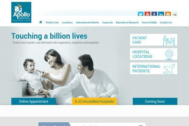
Apollo hospital presents its services precisely on the landing page. the main motive of the landing page is to promote your services and facilities. Apollo hospital land page is designed very well that no inconvenience should be caused to their visitors. the heading is written simple and bold and subheading reflects their service. the features mentioned nicely with icons one by one. also shown appointment booking facilities and some other content.
Apollo hospital presents its services precisely on the landing page. the main motive of the landing page is to promote your services and facilities. Apollo hospital land page is designed very well that no inconvenience should be caused to their visitors. the heading is written simple and bold and subheading reflects their service. the features mentioned nicely with icons one by one. also shown appointment booking facilities and some other content.
HDFC bank
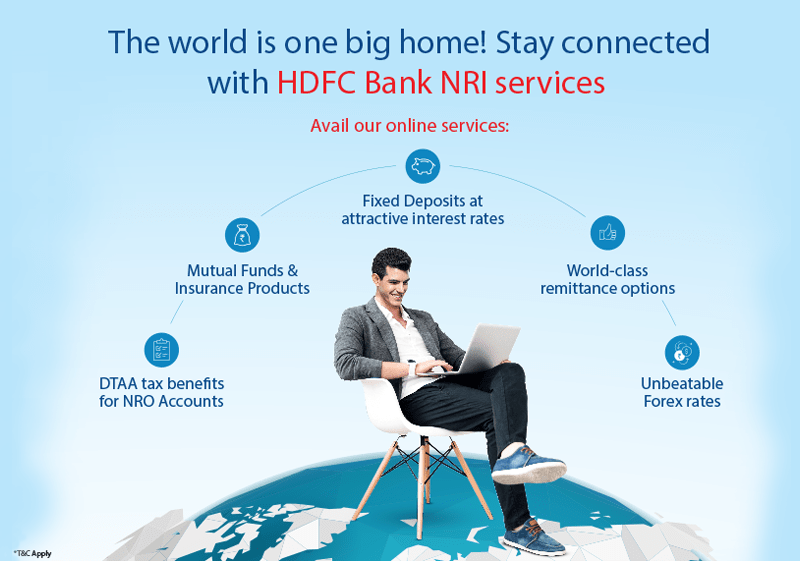
HDFC bank is providing service on the international level. they keep the landing page so simple and informative.the heading is showing the perspective of bank service and small subheading with oneliner text. all features are specified with icon and short detail. the image of a man holding a laptop and sitting on earth portraits that they provide NRI services. hear their motive of promoting their services succeed with this landing page.
Hope! we have cleared some of your doubts regarding the landing page and succeed in telling you the importance of landing page in business growth. So, what are you waiting for create the most attractive landing page for your business and get good reach.
Still, if have any doubts or queries regarding the landing page .you can consult the Addinfi team. we are the best digital marketing agency in Nagpur. Always ready to help you with your market growth.

